Table blocks
A Table block lays out a grid of cells inside a document — rows for entries, columns for fields. Use it for comparison matrices, pricing tables, or any content that wants rows and columns.
1 · Insert a table
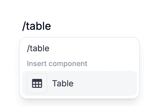
On a blank line, type a slash and pick Table — both "table" and "grid" filter to it. The Insert popover in the top toolbar has the same entry. A 3×3 grid appears at the cursor, first cell focused.
Cells hold text and the inline fields — Short Input, Checkbox, Date Selector, Time Selector. Pick them from the slash menu or the top toolbar's Insert popover, or drag them in from the toolbar. Long Input, Upload File, Signature and Image are blocks, so they land outside the table instead — after it from the menus, or wherever the drop indicator sits when you drag. Tab moves to the next cell, Shift-Tab goes back; neither leaves the table — click below it to continue.
2 · Rows, columns, and sizing
Hover a row or column to reveal a handle along its edge. Drag it to reorder; click it to open a delete popup. Hover the table's bottom edge for a "+" that appends a row, or its right edge for a "+" that appends a column. To add a column on a specific side, use Add Column Left / Add Column Right in the top toolbar's Table section or the block menu on the table's left edge.
Drag the edge between two columns to resize. Double-click that edge to auto-fit the column to its content. Widths are stored with the document, so what you set is what the filler sees.

3 · Three styles
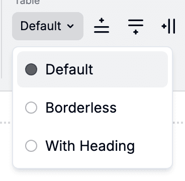
Tables ship with three variants. Default draws gridlines on every cell — best for dense data. Borderless drops the dividers — best when the table is mostly labelling text. With Heading styles the first row as a header.
Switch styles from the table control popover in the top toolbar; place the cursor inside the table to reveal it. The choice is stored per table, so two tables in one form can differ. Each variant looks the same on the public form as in the editor.