Block types
Every Pocper template is built from blocks. Some are prose — text that is part of the form's instructions. Others are input fields the recipient fills in. Here is the full set, and how to drop them into a document.
1 · Add a block
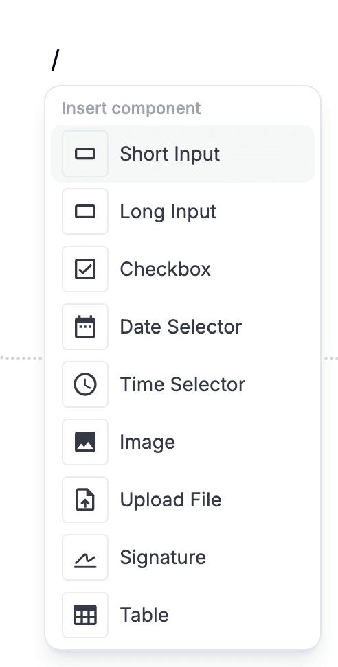
Most blocks come from the slash menu. On a blank line, type "/" and a menu lists every block you can insert there. Click one, or press Enter to pick the highlighted entry.
For the common prose blocks, markdown shortcuts are faster: "# " turns a line into a heading, "- " into a bullet, "1. " into a numbered list.
2 · Prose blocks
These six blocks structure the document. They are read-only for the person filling the form — they give context, instructions and hierarchy.
Heading
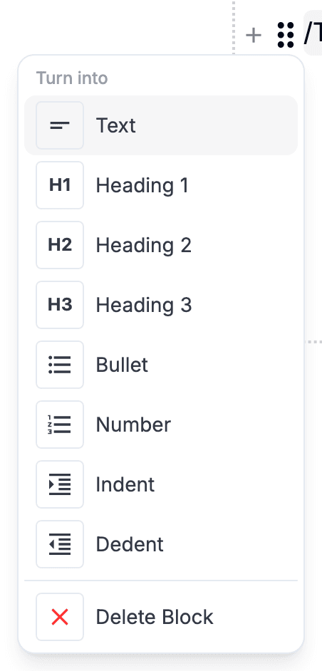
Section title. Use it to break a long form into clearly-labelled parts. Type "# " at the start of a line, or pick a heading level from the block's handle menu or the toolbar.
Text
Plain prose. The default block — just start typing on a new line. Use it for explanations, instructions, or any text that isn't a list.
Bullet
Unordered list. Type "- " at the start of a line. Press Enter on an empty bullet to leave the list.
Number
Ordered list with automatic numbering. Type "1. " at the start of a line. Items renumber themselves when you reorder.
Image
Embedded picture. Pick it from the slash menu and choose a file. Useful for diagrams, screenshots, or branding inside the form itself.
Table
Grid of cells with row and column controls. Pick it from the slash menu. Use it for comparison matrices, pricing tables, or any layout that wants rows and columns.
3 · Input blocks
These seven blocks are the fillable parts. Each collects a specific shape of answer, stored alongside the document.
Short Input
Single-line text field for names, emails, IDs. It widens live as the recipient types, up to the surrounding container's edge.
Long Input
Multi-line text area. You pick a starting height; it grows taller live as the recipient keeps typing, with no inner scrollbar.
Checkbox
Yes / no toggle. Use it for consent, opt-in, or any binary question.
Date Selector
Date picker. Use it for birthdays, deadlines, appointment dates — anything where the answer is a calendar date.
Time Selector
Time picker. Use it for appointment times, shift starts — anything tied to a clock.
Upload File
Attachment slot. The filler drops in a file (image, PDF, doc, whatever fits) and it lands attached to the response.
Signature
Tap-to-sign block. The filler draws a signature on a pop-up pad with finger, stylus or mouse, and the image is stored with the other answers.
4 · Uploads, in more detail
- Files can be dragged straight onto the block or picked, several at once. Each uploads on its own, with its own progress bar and Cancel button, so a large file does not hold up the small ones behind it.
- A failed upload keeps its place with a Retry on it rather than vanishing. If several fail at once there is a single button to retry all of them.
- Each uploaded file shows its size, and pictures load as they are scrolled into view rather than all at once. Files can be dragged into a different order afterwards; the order you leave them in is the order that is stored.

5 · Reorder or remove
Every block has a handle on its left edge. Drag it up or down to move the block.
Click the same handle to open the block menu — that is where Delete lives, alongside changing the block's type.